Disclosure: Some links included in the sidebar are affiliate links, which means we receive a small commission at no cost to you if you purchase through a link.
I have previously written a number of posts highlighting the importance of getting your website visitor’s attention and doing what it takes to hold it when there are constant distractions.
Satyendra Singh wrote in 2006 in the publication ‘Management Decision’ that people make up their minds within 90 seconds of their initial interactions with websites or products.
Have you ever sat down and carefully considered your website color schemes? Well Singh also had this to say about colors..
About 62 - 90% of the assessment is based on colors alone.
So you can put in lots of effort getting it right with such items as your image selection, headings and copy, only to bomb because you’ve subliminally put off your website viewers with your choice of colors!
Your website color scheme sets the mood for your website and your brand. When selecting your colors it’s important to consider what feelings or emotions do you associate with your brand? You can then match them with the ideal colors.
I am extremely envious of those that are visually gifted and good with color because it doesn’t come naturally to me. I have a sense of what works and what doesn’t but it takes me effort and regularly reviewing color theory and psychology to get it right.
I have found it a highly interesting and educational experience looking at the colors used by many household names after reading about the psychology and the thinking behind it. So without further ado, let’s look at the different colors.
Red
The color red is a highly stimulating color and is recognised as the color of energy. Red triggers emotional responses including love, passion and excitement which is what Coca-Cola wants you to associate with it drinks.
It encourages urgency and attracts the most attention and is often used for warnings and important notices.



Restaurants use it to stimulate appetite which is an interesting learning and explains why many of the fast food chains including KFC, Dominos, Pizza Hut and Hungry Jack’s all incorporate red as a significant color.
Orange
A warm and vibrant color which is also considered inviting, welcoming and energising, whilst aiming to set a warm atmosphere. It can create feelings for your website visitors such as friendliness, energy and uniqueness.
It encourages people to take action and attracts impulse shoppers. Different shades of orange represent different feelings and darker shades give off a vintage feel and signs of antiqueness.



Brands that utilise orange in their logos include Amazon, Fanta and Harley-Davidson.
Yellow
Yellow is a highly versatile color which represents youthfulness, optimism and cheerfulness. Bright yellow glows with enthusiasm and gives brands color and energy. Don’t overdo it though because it can strain the viewer’s eyes!
Darker shades are often associated with timeliness, wisdom, antiquity and age.


Brands such as Lipton Tea, McDonalds, Hertz and Jb HiFi incorporate yellow in their logos.
Green
Green is often associated with calm and relaxing emotions, representing health, wealth, nature and tranquility. The relaxation effect is due to being easiest on our eyes to process. Most men and women rank green as their second most preferred color.
It is an ideal color to use when looking for a healthy or environmental theme.
Interestingly, one company that uses green in its logo is BP.
Blue
Is often associated with calm and relaxing emotions and strength and reliability. It is the favourite color of both men and women and emits feelings of loyalty and inner security.
This is why it is so popular with technology and IT businesses.


It is the color of communication which explains why companies including HP, Facebook, Twitter and LinkedIn all use blue in their logos.
Black
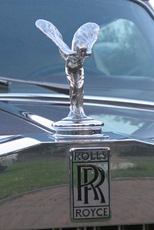
Represents power, luxury, elegance and sophistication which explains why brands such as Rolls Royce, Chanel and L’Oreal utilise it.
Purple
Represents wealth, royalty, wisdom and success and has a calming and soothing effect on people.

Represents wealth, royalty, wisdom and success and has a calming and soothing effect on people. It is often used by beauty and anti-aging companies and is used by brands including Cadbury and Thai Airways.
So you’re now armed with some guidelines you can use when considering colors for your website. To find out more I highly recommend this How to Choose a Good Color Scheme For Your Website article. This article not only provides further help and suggestions but also includes details on some of the color preferences based on gender.
I hope you found the tips shared in this post helpful and that you’ve now got some ideas on website color schemes. Are you looking for further details on any of the suggestions made? Please let me know in the comments.
A tiny request: If you liked this post, please share this?
I know most people don’t share because they feel that we don’t need their “tiny” social share. But here’s the truth…
I built this blog piece by piece, one small share at a time, and will continue to do so. So thank you so much for your support, my reader.
A share from you would seriously help a lot.
Some great suggestions:
– Pin it!
– Share it to your favorite blog + biz Facebook group
– Tweet it!
– Share it on LinkedIn!
It won’t take more than 10 seconds of your time. The share buttons are right here. 🙂

2 thoughts on “How To Choose Good Website Color Schemes”
Will be glad to share.
Awesome post Jonathan!
Thanks again.
Thanks for the kind words Demetrio. I hope you found the tips helpful to you with your website build.